Design - Create - Grow



Want to make a professional t-shirt mockup without touching Photoshop? You’re in luck.
What You’ll Learn:
- How to set up your mockup in Illustrator
- How to use vector shapes and masks
- How to apply artwork and textures for realism
- How to export high-quality previews
If you’re a fashion designer, streetwear creator, or just love Illustrator, this guide will show you how to build stunning vector mockups entirely in
Adobe Illustrator — perfect for mockup presentations, portfolios, and product previews.
What You Need Before You Start
Gather these before you open Illustrator — it makes the whole process smoother:
- Adobe Illustrator, any recent Creative Cloud version. Everything below uses core tools, no plugins needed.
- A flat t-shirt vector template — front view at minimum; front + back if you print on both sides. A clean, symmetrical flat is easier to shade than a traced photo.
- Your artwork, prepared. Vector (AI, EPS, SVG) is ideal. If you’re working from raster, use a high-resolution PNG with a transparent background, at least 2000 px wide — anything smaller turns soft when scaled.
- The right color mode. Work in RGB for screen presentations, portfolios, and product listings. Convert to CMYK only if the mockup is headed for print.
- A reference photo. Keep a photo of a real t-shirt nearby while you work. It takes the guesswork out of where shadows and folds actually fall.
Step 1: Set Up Your T-Shirt Template
- Open Adobe Illustrator
- Create a new canvas (suggested: 2000x2000px)
- Import a flat T-shirt vector (or download a free one from S.i. Graphics Free Mockups)
Step 2: Add Highlights & Shadows
To make it realistic:
- Use the Pen Tool (P) to draw soft shadows under folds
- Use Opacity masks or set layers to Multiply/Screen
- Add neck tag or label outlines for branding
Step 3: Apply Your Design Artwork
- Place your logo/art on a new layer
- Use Clipping Masks to make the art fit naturally
- Adjust warp/distortion for realism
“This is where Illustrator shines: crisp scaling, editable layers, and perfect control.”
Making It Look Real: Wrinkle and Fabric Texture Tricks
Steps 1–3 build the mockup; these techniques sell the realism:
- Study the folds first. Shadows live in the valleys, highlights on the ridges. Pick one light direction and keep every shadow consistent with it — mixed lighting is the fastest way to look fake.
- Opacity masks + gradients. Draw a soft dark shape over a fold, apply it as an opacity mask, and feather it with a gradient. You get a smooth, photographic shadow without touching a blur filter.
- Envelope Distort for artwork. Select your placed graphic and go to Object → Envelope Distort → Make with Warp (or Make with Mesh). The artwork bends with the fabric instead of sitting on it like a sticker — this single step does more for realism than anything else.
- A whisper of grain. Real fabric isn’t perfectly smooth. Apply Effect → Texture → Grain at low intensity over the shirt body to kill the “plastic vector” look. Keep it subtle; you should barely notice it.
- Restraint. Realism is three or four well-placed shadows, not twenty. Overworked shading looks muddy fast.
Step 4: Export Your Mockup Preview
- Go to File > Export > Export for Screens
- Choose PNG or SVG for crisp, high-res results
- Tip: Export with transparent background for product listings
5 Mistakes That Make Vector Mockups Look Fake
- Artwork floating flat. A graphic pasted straight onto the shirt with no warp or distortion ignores every fold underneath it. Envelope Distort fixes this in seconds.
- Shadows pointing in different directions. One light source, one shadow direction. Check every shadow against the others before you export.
- Pure black shadows. Real shadows on fabric are dark gray, not black. Use Multiply blend mode at 20–40% opacity instead of 100% black fills.
- Stretching artwork to fit. Dragging a corner until the design “fits” distorts it. Scale proportionally and reposition instead — or trim the artwork with a clipping mask.
- Everything razor sharp. Real fabric has soft edges. Feather your shadow shapes slightly; hard-edged shadows read as clip art.
Free Illustrator T-Shirt Mockup Pack
Grab a ready-to-use editable mockup from our freebie section:
Benefits of Using Illustrator for Mockups
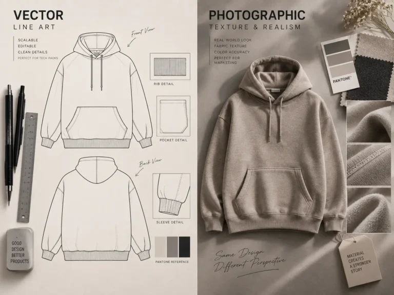
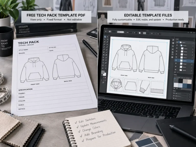
- Fully editable vectors (no pixelation)
- Easier to brand and resize
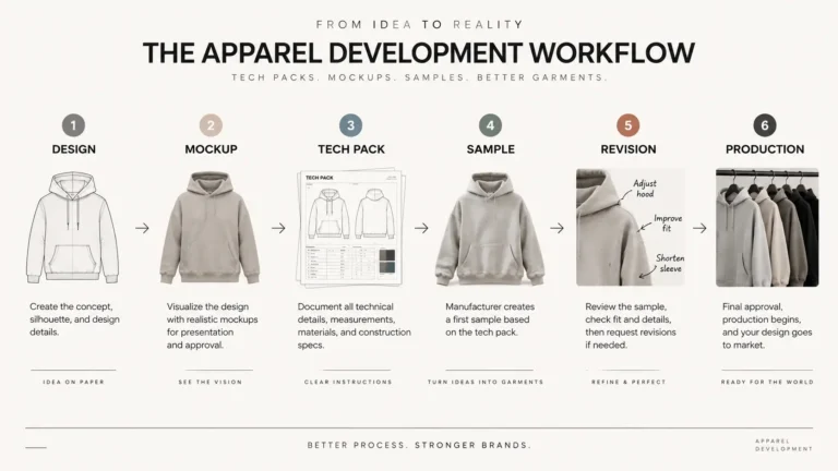
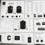
- Ideal for tech packs, lookbooks, and client decks
Illustrator vs Photoshop for Mockups: An Honest Take
Since this guide skips Photoshop entirely, the fair question is what you’re giving up:
- Illustrator wins on infinite scaling, fully editable files, and workflow — one file can serve as your mockup, your tech pack flat, and your print file. No extra subscription or app-switching.
- Photoshop wins on photorealism. Smart objects with displacement maps wrap artwork into fabric wrinkles in a way vectors approximate but don’t fully match. For photo-based mockups, Photoshop is still king.
- The practical answer: many designers do both — build the base vector in Illustrator, finish in Photoshop. But if you live in Illustrator, the techniques above get you about 90% of the way there, which is plenty for portfolios, client decks, and product listings.
Frequently Asked Questions
Do I need Photoshop at all to make a good mockup?
No. Photoshop gives you photorealistic fabric effects faster, but a careful vector mockup in Illustrator — with proper shadows, warp, and texture — looks professional and has the advantage of infinite scaling.
Can I sell designs presented on these mockups?
Presenting your design on a mockup is standard practice. Just check the license of the mockup template file itself — most allow commercial presentation use, but redistribution of the blank template is a separate matter.
Why does my mockup still look flat?
Almost always one of three things: missing shadows, artwork with no Envelope Distort, or shadows in conflicting directions. Fix those three and the mockup transforms.
What size should I export?
2000 px on the longest side as PNG for web and portfolios. Go larger (300 DPI at final print size) only if the mockup is headed for a printed lookbook.